Players Request UI Improvements for Marvel Rivals, From Hero Preferences to Accessibility Design
Marvel Rivals Season 3 introduces the thrilling Duelist Phoenix, but the community passionately demands essential quality-of-life improvements, especially for the chaotic hero selection system.
As a dedicated player who's been in the Marvel Rivals trenches since the beta, I've gotta say, the Season 3 hype is real! NetEase dropped the Duelist Phoenix on us, and she's an absolute blast to play with. 🎮 You can feel the game evolving, you know? But with evolution comes feedback, and the community's been loud and clear about some quality-of-life changes we're dreaming of. It's all about making the experience smoother, more strategic, and frankly, more fun.
For me, the post-match UI overhaul was a major win. No more hunting through menus like a chicken with its head cut off! Now, right after the 'Victory' or 'Defeat' screen, I can see my hard-earned Accessory Points and my exact character progression. It's satisfying, it's efficient – it just flows. You click a tab, and bam, you're claiming your loot. Shoutout to NetEase for listening; that's what I call a solid QoL patch.
But here's the current pickle in the lobby – the character selection phase. Right now, it's a game of blind chicken. You're scrambling to pick a hero, hoping your teammates' choices don't create a team comp with less synergy than the Fantastic Four on a bad day. That's why this idea from the community, which I'm 100% behind, is so genius. Imagine setting a hero profile with your top three preferred mains. Then, on the select screen, those heroes are displayed right next to your gamertag. It's a simple visibility thing that could change everything.
Why This Feature Would Be a Game-Changer:
-
Informed Team Synergy: No more accidentally locking in a third DPS when we desperately need a tank or support. I can see my teammate 'WebHead92' mains Spider-Man, Storm, and Loki, so I might opt for a bruiser like Hulk to complement that ranged/illusion playstyle.
-
Reduced Conflict: It pre-empts those awkward 'Can you switch?' moments. If I see three people have marksmen set, I'll naturally gravitate towards a different role. It fosters cooperation from the get-go.
-
Personal Identity: Let's be real, we all have our mains. This lets us show them off! It adds a layer of personal expression before the match even starts.
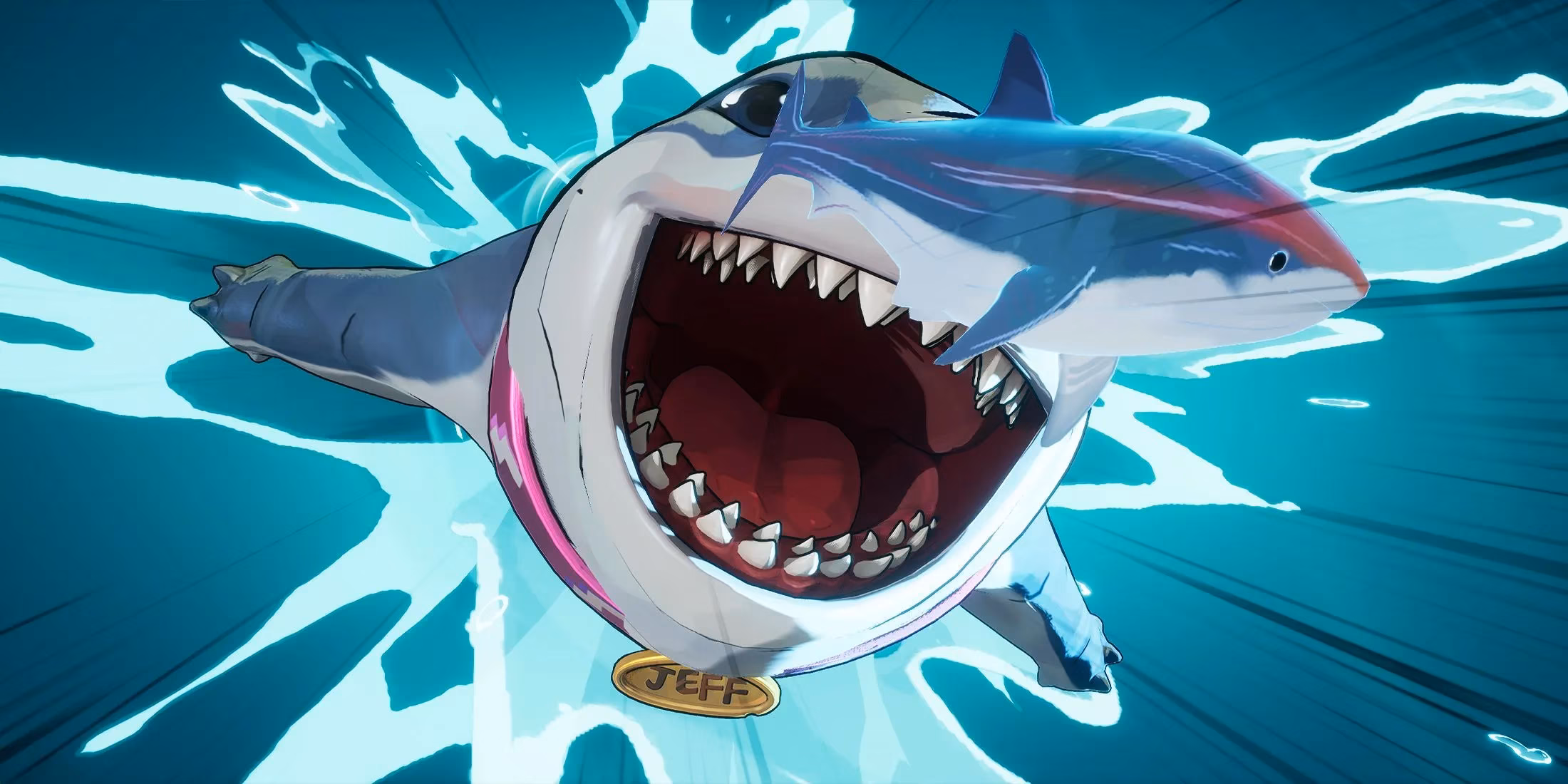
Now, let's talk about the elephant in the room – the hero selection wheel. Look, I love that the roster is expanding (Jeff the Land Shark for the win! 🦈), but scrolling through a spinning carousel of 30+ heroes? C'mon, that feels so 2025. It's cumbersome as hell. The community's plea is simple: give us a grid or a list. Let us see everyone at once. While we're at it, a "Favorites" tab is a no-brainer. Let me tag my go-to heroes so I can insta-lock my main without frantically scrolling past characters I never play. Efficiency is king.
Beyond strategy, there's a crucial conversation about accessibility. One player's story really hit home for me. They use two devices simultaneously due to a disability, and every time the game switches recognition (which is instant), a loud ping and a banner disrupt the experience. Asking for a simple toggle to mute those notifications isn't just a convenience request; it's about making the game truly welcoming for everyone. This is the kind of thoughtful, inclusive design that separates good games from great platforms in 2026.
A Quick Wishlist Table from the Community Trenches:
| Feature | Current Pain Point | Proposed Solution | The "Vibe"
|---|---|---|---|
| Hero Preference Display | Blind picks, poor team comps | Show 3 preferred heroes by player name in lobby | "Let's build a strategy, not hope for the best."
| Selection Wheel | Cumbersome with large roster | Grid view + 'Favorites' filter | "Scrolling is so last season."
| Device Swap Notifications | Disruptive audio/visual ping for some players | Toggle in settings to disable | "Choice and comfort for every hero."
Honestly, the fact that we're having these discussions is a fantastic sign. It means Marvel Rivals has built a community that's invested, passionate, and wants to see it thrive. NetEase has shown they listen with the post-game UI changes. The foundation with Season 3 is rock-solid. I'm optimistic, nay, stoked about the future. If they tackle these UI and accessibility tweaks, we're not just looking at a fun hero shooter; we're looking at a polished, community-driven powerhouse ready for the esports big leagues. The ball's in their court, and frankly, I can't wait to see the next play. Let's make this game legendary, one quality-of-life update at a time. 💥
Comments